10 Great Album Covers, Chosen by Laura Stein of Bruce Mau Design
FKA Twigs, PJ Harvey, Bjork and more
Music brought me to design.
When I was in art school, I pooh-poohed the idea of design. I was in Sculpture, and as far as I was concerned, if your hair wasn’t covered in cement every day, then what were you even doing there. Near the end of my tenure at art school, some friends and I formed a band. We were an “all-girl” band, and being art students and feminists and making melodic, big guitar, personal music, we had a big hand in how we portrayed ourselves. We all designed album, single and EP covers, t-shirts, posters and postcards. And I figured out that design could tell stories, play with cultural codes and expectations, and make statements in the same way that art did, but to a broader audience. And it could be fun.
Our band often didn’t fit into some preconceived ideas of how a “girl-band” should show up. I remember being criticized in the British press for the boring clothes we wore. So I’m celebrating some of the most compelling album covers by female musicians and artists that go beyond pretty or sexy or generic rock chick, and tell us something interesting about the artists and their music.
Patti Smith
Horses (1975)
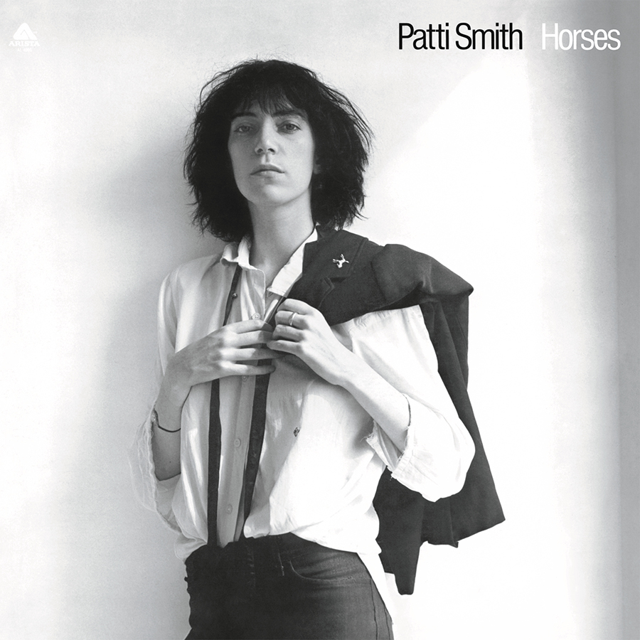
This album was a huge inspiration for everyone in my band. Shot by her friend Robert Mapplethorpe in black and white, this is the height of New York minimalist punk and cool. Smith is wearing androgynous clothes, jacket over shoulder, staring at directly at us, not caring what we think. She has said she was channeling both Charles Baudelaire and Frank Sinatra. The image was revolutionary for a female artist in 1975—the clothes, the stare—and reportedly made records execs nervous. The type, tucked in a corner, is also perfectly minimalist and belies the intensity of the music within.
FKA Twigs
LP1 (2014)
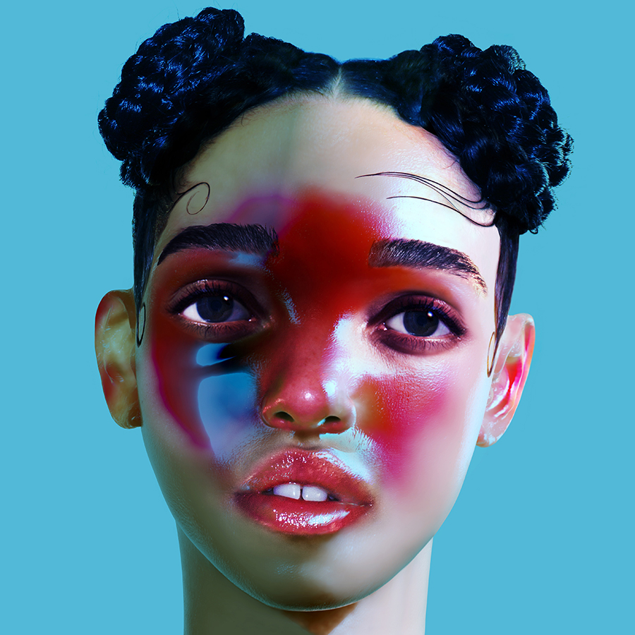
The moment I saw this cover, I had to pick it up to understand it. People have different interpretations, but I see this image of the artist as an almost-porcelain doll—the makeup and pose feel object-like but she might come to life any minute. The scale of the image—it is from the neck up—and the intensity of the cyan background make this incredibly graphic and unignorable. No artist name or title gets in the way of this surreal image, a bold move for a first full-length album.
PJ Harvey
Rid of Me (1993)
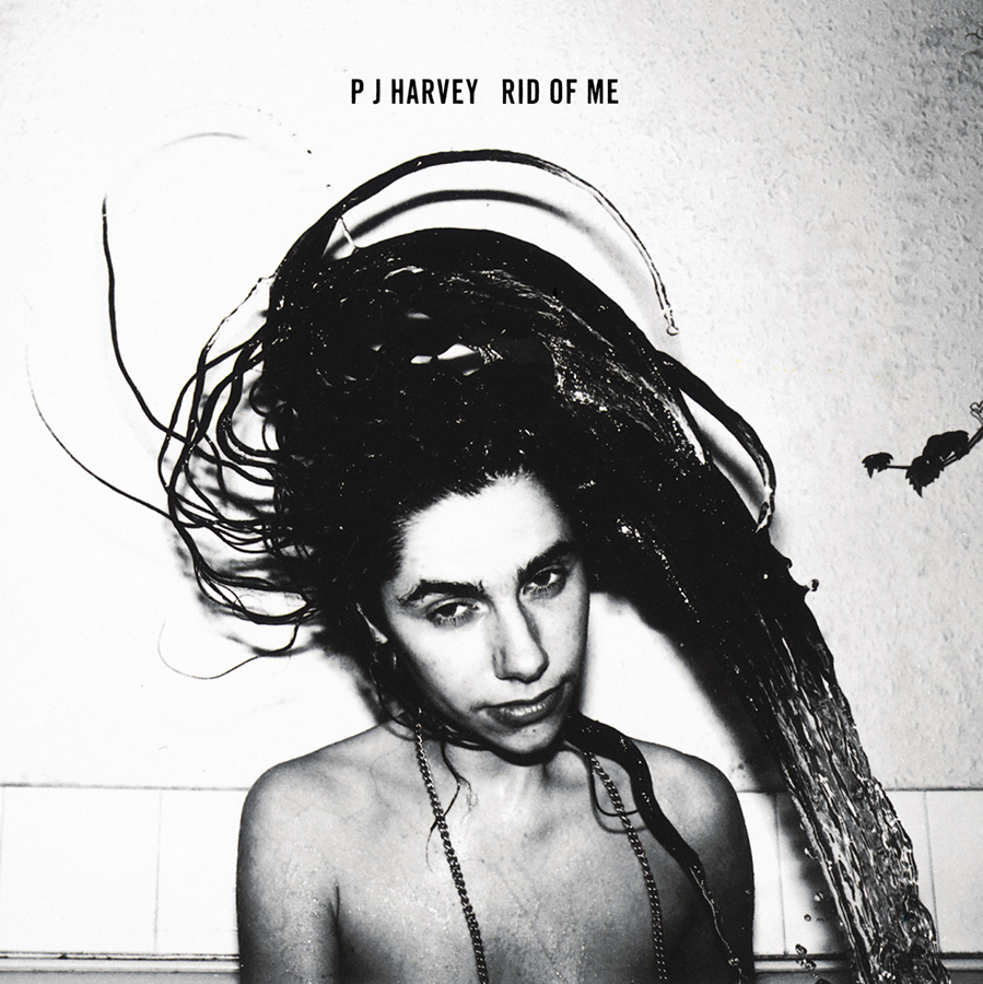
I loved this album when it came out and the aesthetic quality of the image perfectly fits the rawness of the music. Shot by her friend and collaborator, Maria Mochnacz, the photograph is a grainy, high contrast, black and white image of a naked, makeup-less Polly Harvey flipping her wet hair over her head. She is clearly in a bathroom or some other unglamourous space. The record execs wanted to get rid of the plant poking in on the right side but were denied, keeping the image perfectly unpolished. All caps typography feels rough and mechanical and confirms the lack of slick we’ll find in the music.
Bjork
Vespertine (2001)
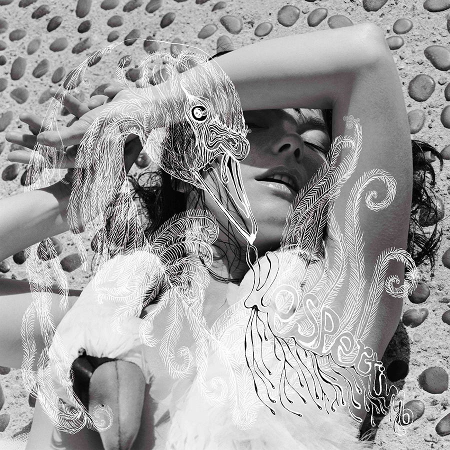
Another black and white image, but this one is sensual and delicate. Bjork is lying on a pebbled ground, arm raised against the sunlight, wearing her famous swan dress. Created with M/M Paris, the overlay drawing of the swan and the dress recall the myth of Leda seduced by a god in swan’s body. The layered hand-lettered title of the album is almost impossible to read but adds to the exquisiteness. This is one of my favorite albums—and the cover perfectly captures the intimacy and intricacy of the music and lyrics of an artist deep in love.
Nina Simone
Silk & Soul (1967)
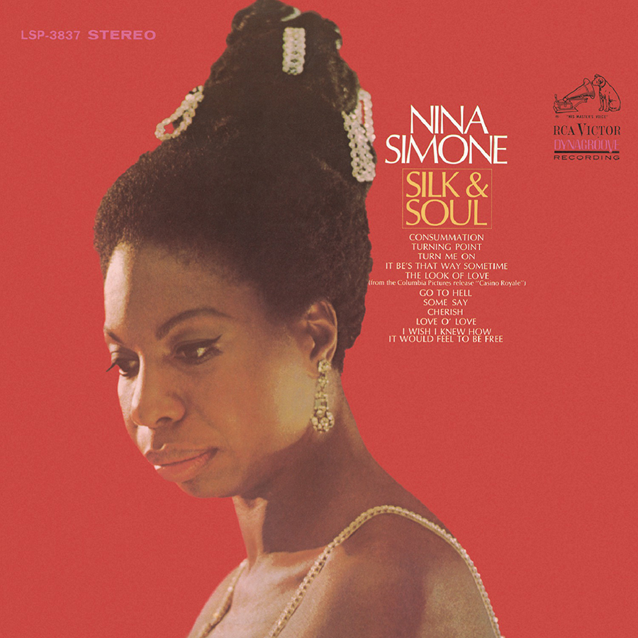
In a classic style for this era and genre, Silk & Soul has a photograph of the artist on a colored backdrop with title and song list on the cover. What I love about this one is the choice of rich orange combined with the yellow-gold of her jewelry and the yellow-gold title. Everything is warm, almost hot. Ms Simone’s hair towers above, adorned in the most queenly way. Her face is pensive, and looking off into the distance. The Optima all-caps type gives it even more gravitas, the touches of magenta make it modern. Nina Simone’s strength and soul is undeniable in this image.
Lizzo
Cuz I Love You (2019)
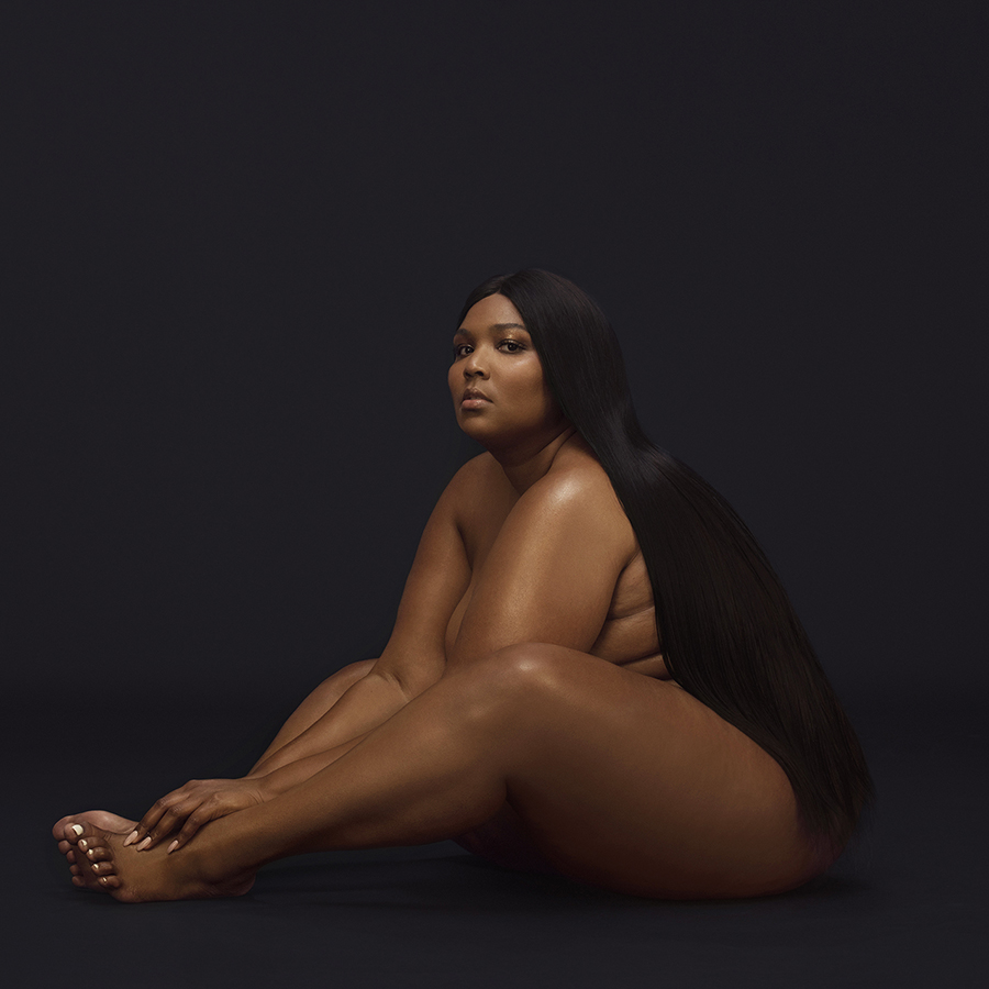
Pure gorgeousness—the inky black backdrop that her hair nearly melts into, the perfect pale pink nails, the shine of her brown skin. She looks at us, challenging us to think she is not beautiful. Again, no title or artist name to be found. The image is enough.
Lady Gaga
Artpop (2013)

Maximalist and artful in all the best ways. Artist Jeff Koons created a naked Lady Gaga sculpture with a big reflective blue sphere that acts as a modesty moment and a metaphor. Surrounding the sculpture are collage images of renaissance painting and sensual black and white photography. The big bold magenta type is also collage and grounds the whole image. I’m not particularly a Lady Gaga fan, nor a Jeff Koons fan but I love this cover.
Erykah Badu
But You Caint Use My Phone (2015)

This is a mixtape—hoping it counts because this cover is wild. So many references, from dime-store catalogs to Hindu gods. Erykah Badu is drawn as a naked comic book goddess / speaker system, each of her many hands holding telephones from every era. Created as a response to Drake’s Hotline Bling, it feels experimental, witty, funky, high and low. The black and white and gradient give it a psychedelic flavor.
Lana Del Rey
Chemtrails Over the Country Club (2021)

I love this cover, which feels like a snapshot of a happy gathering of sisters and friends, the kind you take at a birthday party. Lana Del Rey is just hanging out among them—captions have to note that she is “fifth from the right”. It’s so casual and artless that it makes a statement, especially from an artist who is known for more controlled image-making. The title lettering gives it a bit of retro kitsch, which is part of the Lana Del Rey visual world, but I wish they had done it straighter. Even so, I love the sisterly-ness of this as an entry into the album.
Lorde
Pure Heroine (2013)
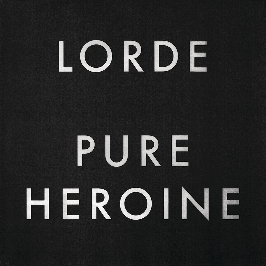
The opposite of everything we’ve just been looking at. Just big, black and white type, and Futura all-caps that you can read across the room. What could be better? It feels like a title card for an old film the way the letters slightly disintegrate at the edges. It also feels punk. Lorde was just 16 when this came out and I can imagine the push back when the album design was presented. So glad they just went with it.
Art of the Album is a regular feature looking at the craft of album-cover design. If you’d like to write for the series, or learn more about our Clio Music program, please get in touch.


